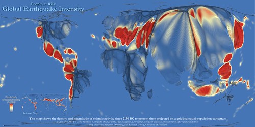
A geographer from the University of Sheffield has created a very interesting (quite shocking too!) map. It is a map that shows the relationships between earthquakes and human population. What is the map telling us? Read on to find out.
Global Earthquake Intensity Map shows who is more likely to be hit with earthquakes. Where are you on the map?
The map is produced by Benjamin Hennig which is a part of his extraordinary world visualization research. It contains records and information of major earthquakes gathered from 2150 BC to the present day. More or less 4,000 years of history is right there on the map!
Data represented on the map looks pretty weird at a glance. This is due to the fact that data has been manipulated in such a way that only populated areas are highlighted while non-populated areas are completely eliminated. The map is described as an equal-population map allowing us to see the relationships between the intensity of earthquakes and today’s distribution of population. From the map, you can see who is more likely to be hit with earthquakes and you can also see how the risk relates to the world population. Take a look at the full size map and tell me, where are you on that huge map?

Via Views of the World


0 comments:
Post a Comment