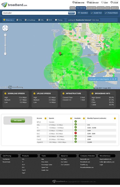
Bandwidth.com has launched a nice Google-powered interactive map that provides an unbelievable wealth of information about broadband services, broadband coverages and penetrations in the United States. The map is a gold mine! What other features does the interactive map has? Read on to find out.
US Nationwide Broadband Map launched! Lets YOU find Ways to IMPROVE Your Broadband Experience
The newly launched interactive map gathers data from the FCC, ISPs, Net Index and the official .gov National Broadband Map. That’s why it has so much information that I really don’t know where to start so I’m not even going to try. You just have to explore the interactive map and discover things on your own.
Let me just give you some ideas on the things that you can do on the newly launched interactive map:
- Compare speeds of broadband connections by city
- Compare broadband penetration rates by city
- See the performance of ISPs city by city, complete with information about their broadband quality and real-world download and upload speeds
- Identify DSL coverage areas
- Get detailed information about existing ISPs and their services
- Get real-time service pricings
You can explore the interactive map at broadband.com and the site also has a few other resources that should come in handy for broadband users. Resources include an internet configuration tool, speed test tools, a knowledge center and a few others.


0 comments:
Post a Comment