Learn how to choose the right font face for your Google AdSense ads since using the right font face could tremendously help Google AdSense publishers! ;)
How to choose the right font face for your Google AdSense ads
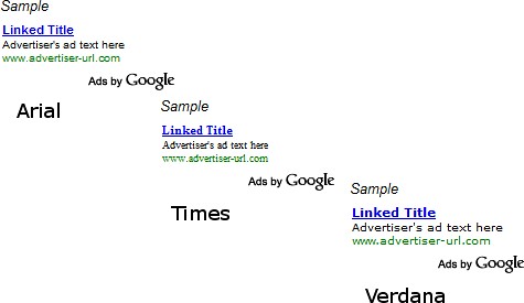
Google gave AdSense publishers a big surprise on February 19th 2009 in the form of a new customization option that allows AdSense publishers to change or customize the font face of their AdSense text ad units. Yes, AdSense publishers now have 3 new font faces to choose from other than the standard AdSense font face; Arial, Times and Verdana (examples shown down below). The new customization option leaves some AdSense publishers with the following question; “How to choose the right font face for my Google AdSense ads?”
Let me give you some tips:
- Theoretically, the best font face for your Google AdSense ads should be the one that is similar or closely resembles the font face that you are currently using by default for your content. That is what many experienced AdSense publishers have been screaming so far and I tend to agree with them.
- If your default content’s font face looks so glaringly different than those provided by Google, please consider changing your existing font face. Many experienced AdSense publishers believe that blending your AdSense ads (color, background and now font face) with your content works wonders. ;)
- To be safe, I strongly recommend that you test all 3 new font faces including the default AdSense font face for a certain period of time. Perhaps one week for each font face for a site/blog that has more than 1K unique visitors per day and a month for those that have lesser traffic. Compare the results and see which font face works best for your site/blog. Remember, each site/blog has different characteristics and no two sites monetize the same way! ;)
Good luck! :)


4 comments:
I think there is a best font for the higher revenues, but, at moment, I don't understand if it is verdana or arial; (times is the baddest). I think that new possibility will be really useful when also AdSense's links will be ables to choose the font. That is my experience. Bye from Italy
I personally prefer to match the font to my site, but for forums etc. it might be better to chose a radically different font size to combat ad-blindness.
One thing to ask. Does anyone actually click at those ad? For me, I never click at those ads coz I know they're ads.
HyperX,
Not all are scared of ads like you, there are those that have learned a lot from ads such those shown by Google AdSense and I'm one of them. ;)
Hey, you have AdSense ads on your blog too. How would you feel if nobody clicks on your beautiful AdSense ads? ;)
Post a Comment